Wednesday, 11 January 2017

Pantone Color of the Year 2017 and Visit to St Nicholas Abbey, Barbados - Greenery Inspiration

I am taking part in the Creative Arts Collaboration Facebook Group color challenge, which starts today and our posts and videos will be inspiration around the Pantone Color of the Year 2017 which is Greenery.

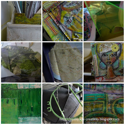
I shared in a previous post all the various things in my studio that share the same color HERE, and here are some of the images from the post, in which you can see the color and many shades popping up.

http://realityarts-creativity.blogspot.com
Greenery around the studio

I do find the color both inspiring and relaxing at the same time.

And I was quite surprised at how many examples of the color I do have around my studio space and that I use in my art.

http://realityarts-creativity.blogspot.com
Sneak Peak at some artwork in the studio

I wanted to share with you in this post a sneak peak at some of the art work that I am going to share with you in a few days, but to also look at a visit I made with my family to St Nicholas Abbey, Barbados.  We will look at some of the very obvious examples of 'Greenery' as St Nicholas is set in a lush environment, and the not so obvious examples of the color showing up.

St Nicholas Abbey is one of the islands oldest surviving plantations, set in over 400 acres of cane fields, tropical gullies, mahogany forests and formal gardens...... for more information click HERE


We paid them a visit to take in a tour of the grounds and see how the rum was made with brother-in-law Mike, hubby - Alan and Son Sekani.  
http://realityarts-creativity.blogspot.com
Enjoying the grounds we spent quite a while wandering round


We got to see how the rum was made, had a taste or two and walked leisurely around the gardens which was very beautifully maintained.  It is owned by Anna and Larry Warren who we met, and Anna showed us where they bottled the rum, all done by hand, the bottles engraved and enjoyed all over the world.


http://realityarts-creativity.blogspot.com
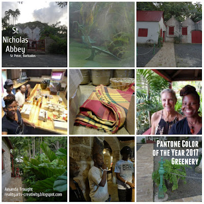
Anna Warren and Amanda Trought-Springer (St Nicholas Abbey) Surrounded by Greenery

http://realityarts-creativity.blogspot.com
Anna shows us some of the many things produced from the sugar and packed by hand

I do recommend that you go and visit if you are ever in St Peter, Barbados.  While I was at St Nicholas Abbey I looked out for examples of the - Pantone Color of the Year for 2017 which is Greenery and indeed it was all around.  I took some obvious and not so obvious shots.
http://realityarts-creativity.blogspot.com
We took in everything

I picked out the color every where I went, from the hazy green on the walls in the corridor, to the air exposed corrosion on metal which gave a pale green color...

http://realityarts-creativity.blogspot.com
All the little detail - the stories to tell..

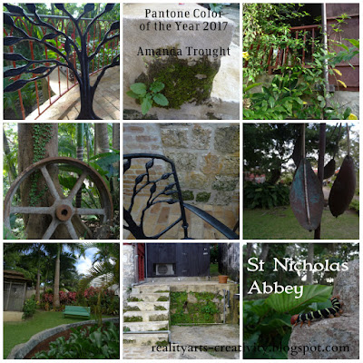
Around the grounds we saw many examples of Greenery
http://realityarts-creativity.blogspot.com
an inspiring color

where the sugar canes were crushed and the juice squeezed out, machinery maintained, moss finding a home, blending in, memories implanted in the brickwork,

http://realityarts-creativity.blogspot.com
color in places you might not normally notice

 walking around the grounds, very peaceful hearing the wind dancing in between the leaves, telling a different story from long ago.  

http://realityarts-creativity.blogspot.com
take your time and soak in the environment

Seeing the color in the rum soaked scotch bonnet peppers, as they loose their redness  and fade to green to the delicate leaves painted on the crockery in the restaurent.  Look out of any window and catch the color!

http://realityarts-creativity.blogspot.com
Visitors always welcome!

Light hits the etched glass, reflections past and bounces off the leaves that danced and wave through the windows.

A final good bye at Cherry Tree Hill will pull you back so much more to see ... next time!

Last views at Cherry Tree Hill

Tour done, I end my day at home with a cup of Earl Gray tea and a little something sweet!

http://www.pantone.com/press-release-pantone-unveils-color-of-the-year-2017-pantone-15-0343-greenery
Might have to add a little rum in that...lol!


I hope that you enjoyed seeing some of the color inspiration at my visit to St Nicholas Abbey.  We enjoyed our visit and will go again, there is still so much to see and take in.  

Do check out my YouTube channel for my video inspiration around the Pantone Color of the Year on Saturday where I will show you examples of my outdoor garden inspiration and some of my art where I have used the color. If you want to see more of the Caribbean I have started a Destination Barbados blog for all of my Caribbean inspiration through photos and blogs.

Stay blessed and be a blessing.


Tuesday, 10 January 2017

31 Creative Things to do with Recycled Materials - Promarker Pen Holders - Day 7

Creative Recycling, one box/can/bottle/ at a time!


Do you have lots of pens all over the place that need a home?

Do you want to see what you have and don't want to hide them? 

Have you a small amount of space to work with?

Then look no further!!  Over the next few days as part of the '31 Creative Things to do with Recycled Materials' and the 'Ultimate Blog Challenge' I have a few 'pen' storage ideas to help you with your problem.

I have always had this problem in my work space when I started out, especially when I worked from the edge of my kitchen table.  Many moons later I have a bigger space but still need to be mindful about what I store and where.

Moving into my current space I wanted one of those racks you see in the magazines, but surrounded by so many milk cartons and boxes I knew that I would be able to create something to my specification and at a fraction of the price.  

Creative Thinking Cap on to do something with this little lot!

I wanted something a cross between the one below but that could fit on my desk. You can check out the one below and they also have others which may work for you.


The holders that originally came with the pens were these and these didn't work for me considering the amount of pens that I have and the space that they took up.  I am going to have to find an alternative use for them:)


I wanted to make an upright holder and began to think of the best possible materials that I had and the design.  I didn't follow a pattern, I just knew how I wanted it to look and then just kept going and this was born.  

This was the before and the after, quite a transformation!
 

The Before - milk cartons and cardboard


The After

 I painted it an gave it a 'shabby chic' look and finished it with varnish and gold metallic rub.  I am able to view all the colors and keep everything organised.  


The one thing that the pens could do with now is the color indicator on the top.  The pens that I originally brought were the old design, you can purchase some labels or again make your own.  

The top of the storage allows me to keep to hand the pens I am using in a project and the rest can be stored horizontally as needed.


I might add some swirls or stenciled designs to the storage container, but I am please with the results and the much needed storage that I now have for my pens.  Come back to see what I have done with my Alcohol Markers

For more inspired recycling ideas and useful tips check out Zero Waste Barbados and Journey to Zero Waste 

Have a look at some of my ideas on my Pinterest Recyled Board

Blessings


31 Creative Things to do with Recycled Materials - Birds - Day 6

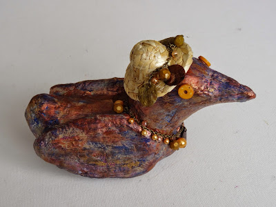
Welcome to My Day 6 of the Ultimate Blog Challenge.  I am running slightly behind and hope to catch up with all the things I want to share with you.  I was inspired to make the ducks after watching Heather Santos on a course called Soul Food run by Mystele  There are always nuggets to take away in Mysteles courses for you to add your own spin on it.  Check them and their videos out they are both inspiring.

What is quite funny about watching ducks in the water is that they usually look so calm and collected on the surface, moving from one place to the other in the water, what we don't see is the action beneath the water.  Their feet are moving very quickly in a flurry to get them from one place to the next, yet here they are making it look easy.

31 Creative things to do with Recycled Materials
Amanda Trought - Mixed Media Art - Sculptured Bird

After making the first duck I just went on to make a few more, and now love how you can transform recycled material.  The base for the ducks is foil which really compacts well, so if you are looking for a use for any foil you may have laying around here is a great example.  Obviously if you have used it to cover food or cooking you will need to wash it first.

31 Creative things to do with Recycled Materials
Amanda Trought - Mixed Media Art Bird

31 Creative things to do with Recycled Materials
Amanda Trought - Mixed Media Art Bird

The other thing I use is recycled paper, made into clay, and I found a great recipe online.  I altered it slightly to suit but it is archival, long lasting and another fun way of recycling.  The last additions were the embellishments to make them unique. I will be posting my recipe and a video of how I make the paper clay for you to give it a go.

Ok, so you met these three birds you'll have to be introduced to the rest of the family...(smile) at some point I want to share some of the tropically based sculptures that are beginning to show up, but that is for another time!  

Stay blessed and be a blessing!

In the meantime you can:

Sign up for a course I will be teaching on

Sign Up HERE

My Course Bonuses you get for free when you sign up HERE

Free Booklet - 25 Ways to fit Art and Creativity into your life!

Art Workshop, Over 2 hours of instruction - sigh up using the link above and get this free

Friday, 6 January 2017

Pantone Color of the Year 2017 - Greenery - Around the studio

I have been inspired in my studio by the Pantone Color of the Year for 2017 which is Greenery.


What is the PANTONE Color of the Year?
"A symbolic color selection; a color snapshot of what we see taking place in our global culture that serves as an expression of a mood and an attitude."
Who is the Pantone Color Institute
"The Pantone Color Institute is a color research and information center that shares its color expertise with professionals in a variety of industries including fashion, commercial/industrial, contract and interior design, graphic arts, advertising, film and education.
Pantone studies how color influences human thought processes, emotions and physical reactions, furthering its commitment to providing professionals with a greater understanding of color and to help them utilize color more effectively. Leatrice Eiseman, America's leading color expert, is the executive director of the Pantone Color Institute."

I am really interested in the way that color can impact on our health and well being.  I ran Art and Creativity workshops for a 4 year period with the elderly living with dementia, and encouraged my mother now 93 years old who has lived with dementia for the past 18 years and whom I was caring for to take part in creative activities. I saw the value of using color in an art activity, and the impact it made whether you were a participant or a viewer.  Check out my Arts In Health site and the resources of other organisations working in the field.

Creativity really touches parts of the brain that we just cannot truly understand and I found after the Arts and Creative activity the participants in my group became more focused during the rest of the day and they engaged with other activities, were more relaxed and they would talk about the activity that they took part in with others.  

Mum at the Art Session I ran at the day care centre

The work was displayed around the center and they were very proud of their efforts.

Mum liked patterns and lots of color - especially red

I was able to talk about my work in the Barbados magazine Better Health and shared my passion for the Arts and Health and the connection to our well-being.


Since hearing about Greenery as the Color of the Year, I thought I would see how much in our everyday the colors are being used.  It is amazing how once a particular color is highlighted you begin to notice it more.  I went round my studio to see examples of 'Greenery' and there was more than I thought. 

Greenery - Pantone Color of the Year 2017
Can you identify any of the items?

After I began focusing on on the color I saw it everywhere, and obviously looking out the window it is all around.  


Greenery - Pantone Color of the Year 2017
Some of the items are more obvious than others....

A lot of my supplies and tools have elements or shades of the color...

Greenery - Pantone Color of the Year 2017
Some you may have seen....

I also use the color quite a bit in my paintings, and over the coming week will be sharing more about my creative process and where the color has featured in my work.

Greenery - Pantone Color of the Year 2017
Some you may even own!

I will also be sharing more over the next week or so a trip I made to St Nicholas Abbey which is set in very lush surroundings and I took lots of photographs where the color greenery is evident and how it is used in the setting, from around the home to out in nature. 

St Nicholas Abbey - set in 350 acres!

I will also be sharing a video on my YouTube Channel - Realityart of 3 pieces of art work where the color and shades have featured quite a bit.  I hope you can join me, and perhaps it will encourage your creative adventure.

Sign up for my mailing list (on the side bar) and check out some of my other links listed.  It would be great to have you on board.  

Stay blessed and be a blessing!
Related Posts Plugin for WordPress, Blogger...