What is the PANTONE Color of the Year?
"A symbolic color selection; a color snapshot of what we see taking place in our global culture that serves as an expression of a mood and an attitude."Who is the Pantone Color Institute
"The Pantone Color Institute is a color research and information center that shares its color expertise with professionals in a variety of industries including fashion, commercial/industrial, contract and interior design, graphic arts, advertising, film and education.
Pantone studies how color influences human thought processes, emotions and physical reactions, furthering its commitment to providing professionals with a greater understanding of color and to help them utilize color more effectively. Leatrice Eiseman, America's leading color expert, is the executive director of the Pantone Color Institute."
I am really interested in the way that color can impact on our health and well being. I ran Art and Creativity workshops for a 4 year period with the elderly living with dementia, and encouraged my mother now 93 years old who has lived with dementia for the past 18 years and whom I was caring for to take part in creative activities. I saw the value of using color in an art activity, and the impact it made whether you were a participant or a viewer. Check out my Arts In Health site and the resources of other organisations working in the field.
Creativity really touches parts of the brain that we just cannot truly understand and I found after the Arts and Creative activity the participants in my group became more focused during the rest of the day and they engaged with other activities, were more relaxed and they would talk about the activity that they took part in with others.
 |
| Mum at the Art Session I ran at the day care centre |
The work was displayed around the center and they were very proud of their efforts.
 |
| Mum liked patterns and lots of color - especially red |
I was able to talk about my work in the Barbados magazine Better Health and shared my passion for the Arts and Health and the connection to our well-being.
Since hearing about Greenery as the Color of the Year, I thought I would see how much in our everyday the colors are being used. It is amazing how once a particular color is highlighted you begin to notice it more. I went round my studio to see examples of 'Greenery' and there was more than I thought.
 |
| Can you identify any of the items? |
After I began focusing on on the color I saw it everywhere, and obviously looking out the window it is all around.
 |
| Some of the items are more obvious than others.... |
A lot of my supplies and tools have elements or shades of the color...
 |
| Some you may have seen.... |
I also use the color quite a bit in my paintings, and over the coming week will be sharing more about my creative process and where the color has featured in my work.
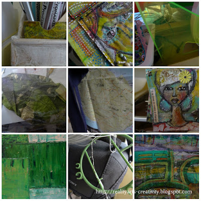 |
| Some you may even own! |
I will also be sharing more over the next week or so a trip I made to St Nicholas Abbey which is set in very lush surroundings and I took lots of photographs where the color greenery is evident and how it is used in the setting, from around the home to out in nature.
 |
| St Nicholas Abbey - set in 350 acres! |
I will also be sharing a video on my YouTube Channel - Realityart of 3 pieces of art work where the color and shades have featured quite a bit. I hope you can join me, and perhaps it will encourage your creative adventure.
Sign up for my mailing list (on the side bar) and check out some of my other links listed. It would be great to have you on board.
Stay blessed and be a blessing!









Wonderful, wonderful post! I cannot wait to see the next one! Thank you for Sharing all this wonderful information about Pantone.
ReplyDeleteThank you Lynne, Loving your work by the way!
DeleteHi Amanda - colour does affect us ... and fresh air with all the new greens, that are on their way ... I found out about Pantone colours - after looking up the yellow Selfridges used back when I started blogging ...
ReplyDeleteEnjoy this development and your learning which you'll let us know about ... fascinating - cheers Hilary
Hi Hilary, it is amazing the affects that color has on our health and well-being, I will keep you updated.
DeleteI have notice Green has been used recently on store shelves to hook into a growing marketing trend to buy/sell "green" products. When I look around outside, I see mostly white (snow) and black ice covered pavement.
ReplyDeleteHi Doug - Yes apparently they select the colors a year in advance, it is interesting to see how much we are influenced by their choices. You'll be seeing the new colors of spring soon:) Wrap up warm.
Delete